
What’s Inside a Design System
| Concept | Purpose |
|---|---|
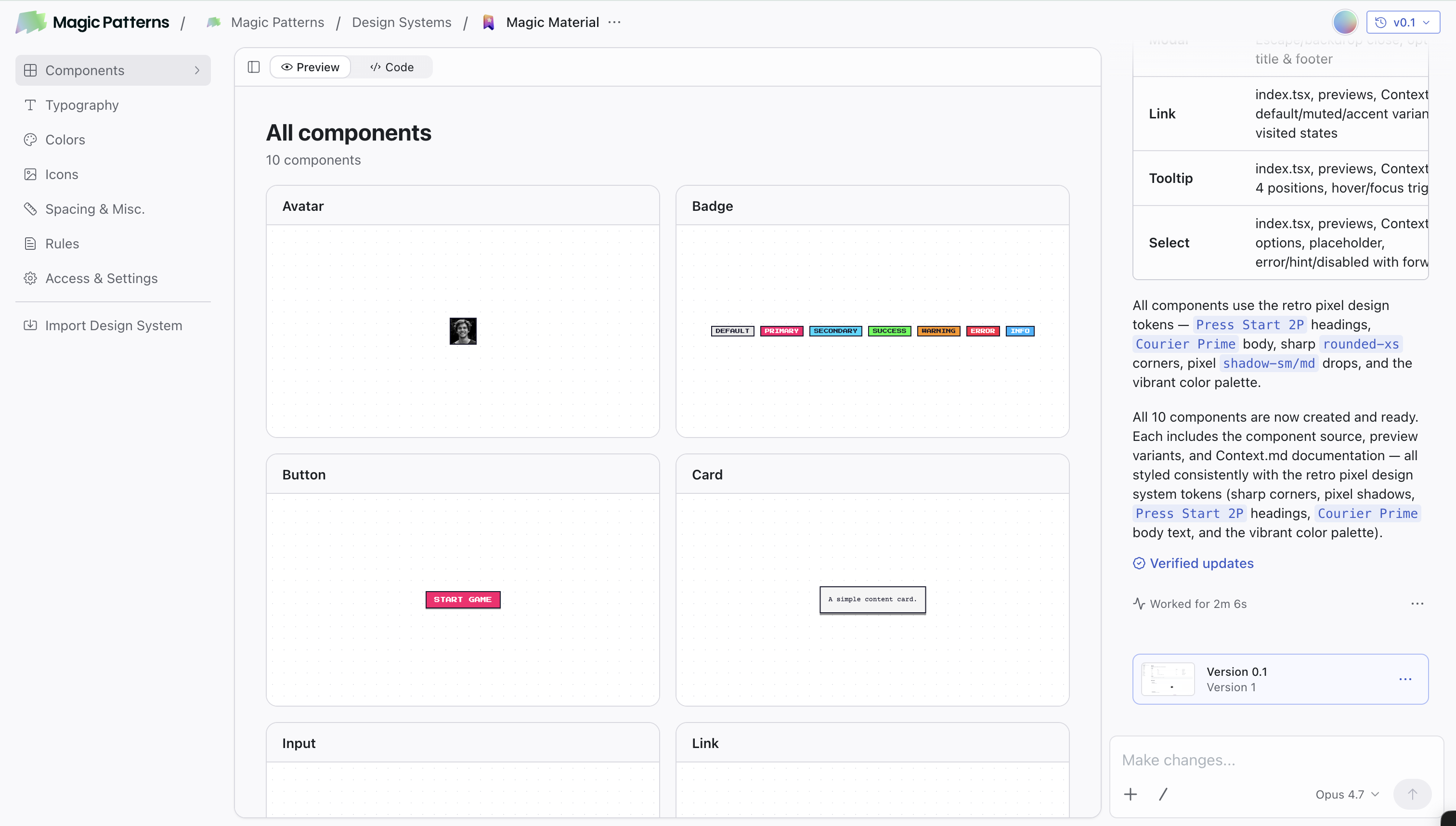
| Components | Browse and manage reusable UI building blocks used across your designs |
| Typography & Icons | Manage font groups and icon sets used across your designs |
| Colors | Visually manage your brand color tokens, with dark mode and token references |
| Rules | Default styling rules (spacing, visual style, brand voice) applied to every design |
| Skills | Reusable instructions the AI activates when a task matches their description |
| Access & Settings | Manage sharing, permissions, and other Design System configuration |
Getting Started
Create a Design System
From your dashboard, click Design Systems → Create a design system. You can also go directly to magicpatterns.com/design-systems.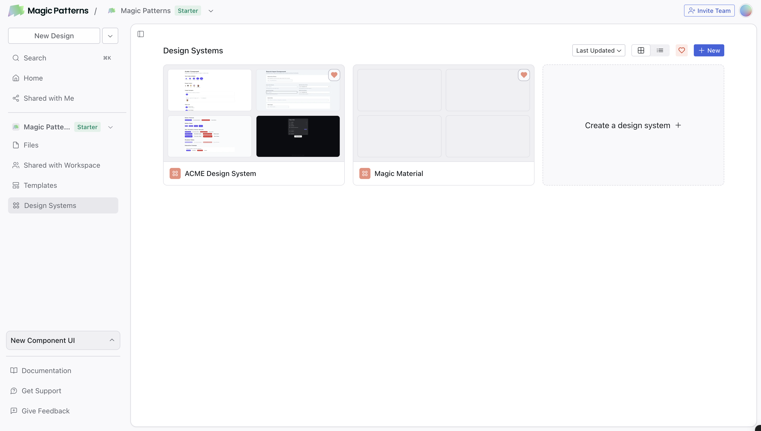
Import your existing sources (optional)
Already have a design system? Link GitHub, an NPM package, Figma, or your website to seed components, colors, and tokens. See the importing overview.
Add your Rules
Define your spacing, visual style, and brand guidelines. This acts as a default prompt for all designs. For those familiar with other AI tools, you can think of this as “default prompts” or “skills” that are applied to the context of all designs.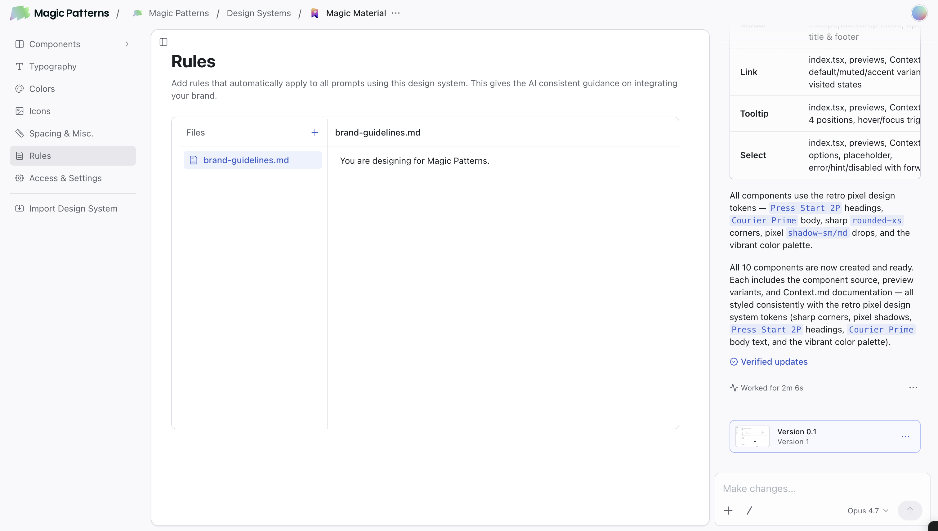
Set up Typography and Icons
Go to Typography to manage font groups (custom fonts, Google Fonts, or font URLs) and Icons to pick an icon library or upload your own.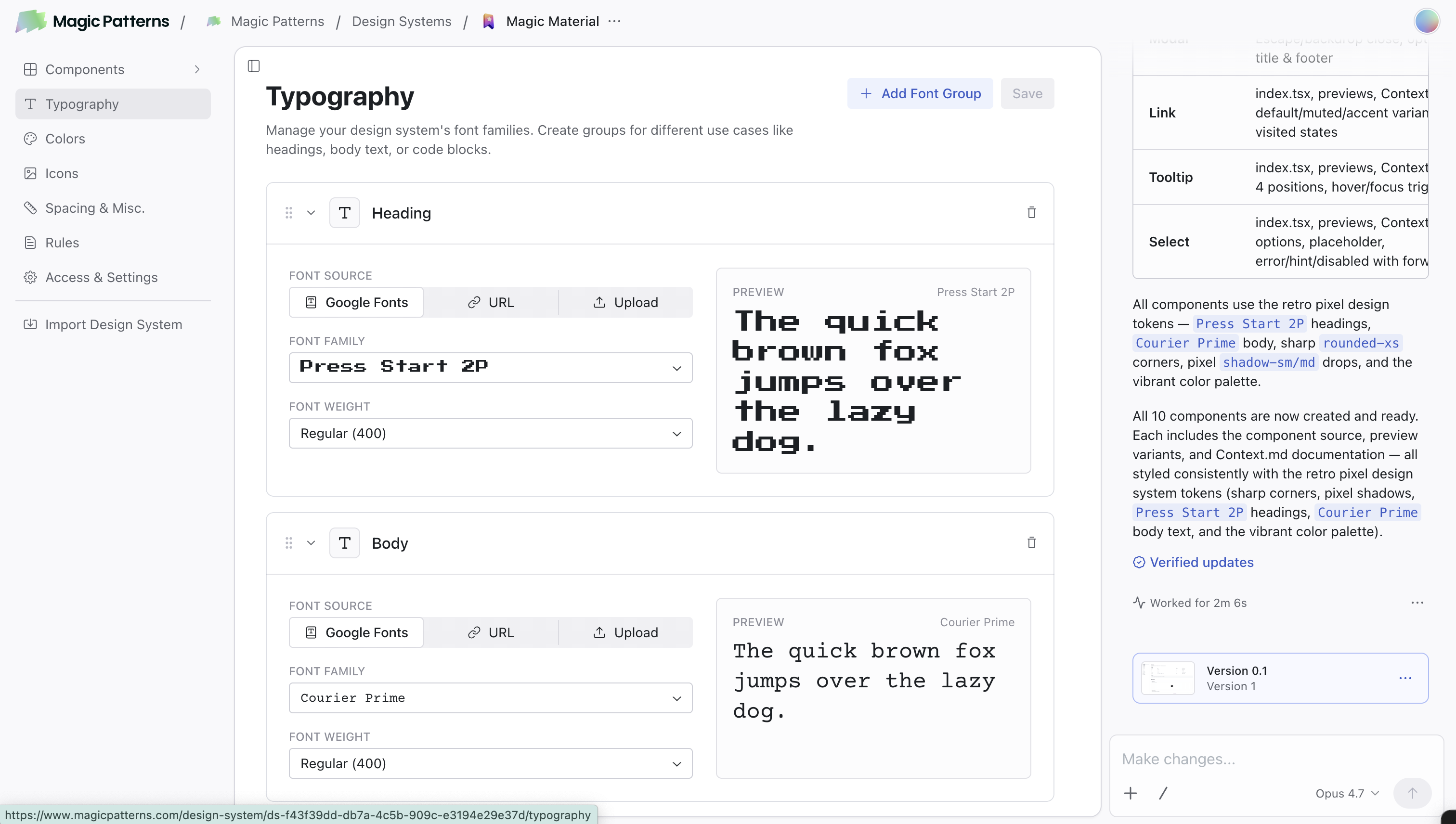
Define your Colors
Open the Colors page to set up your brand palette with colors like Primary, Secondary, Accent, and more.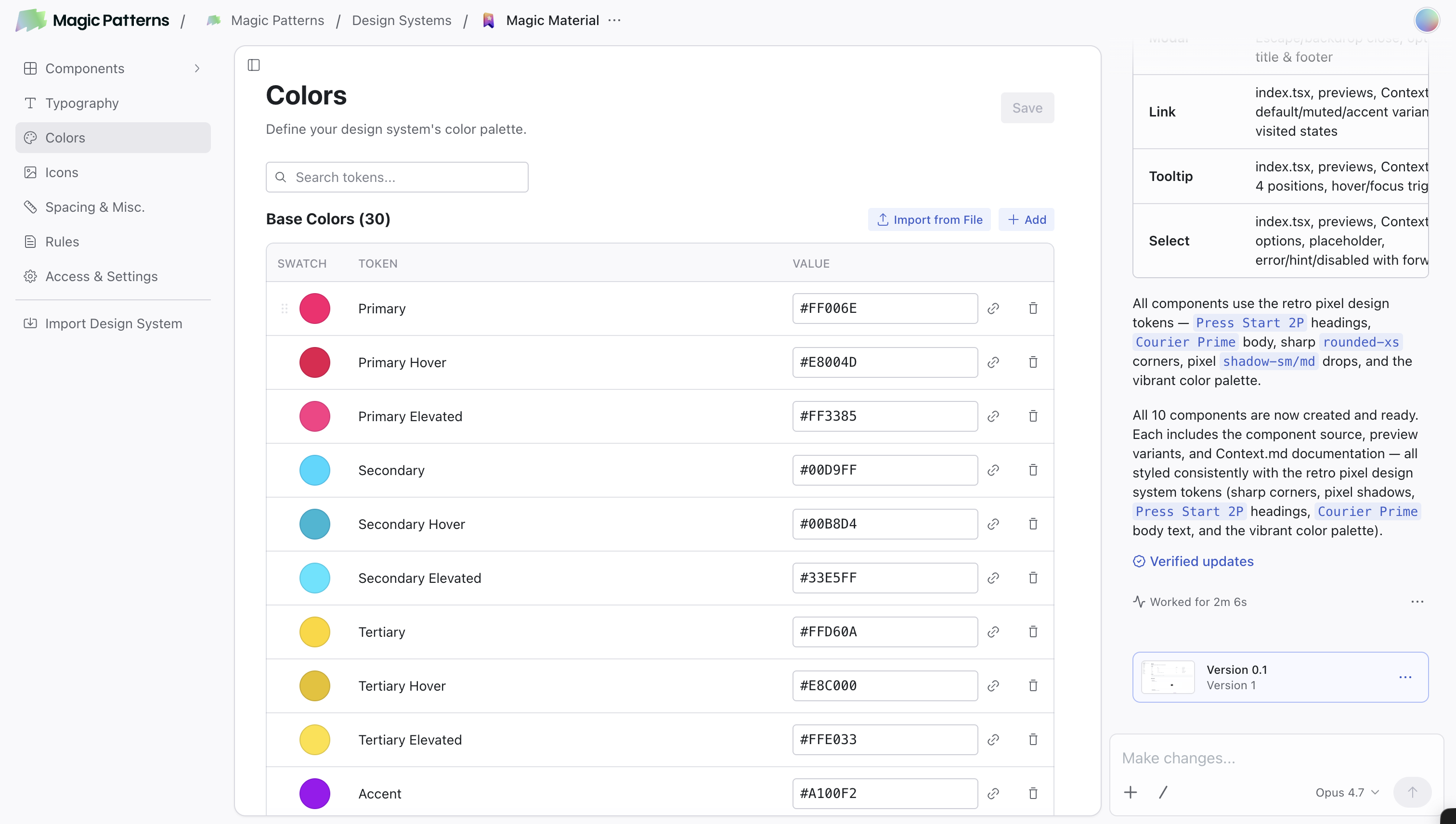
Editing your Design System
Once your Design System is set up, you keep evolving it from one place: a single chat that lives with the Design System. The chat is available on every tab (Components, Typography, Colors, etc.) and operates on the whole Design System. You can edit one component, several at once, or make universal updates like changing a color token or tightening the spacing scale system-wide. Versioning and publishing also happen at the Design System level.Editing components and your Design System
Learn how to chat with your Design System to add, edit, version, and publish
components.
How to Use It
When creating a new design, select your Design System from the dropdown. The AI will automatically:- Apply your Rules
- Use your color tokens from the Colors page
- Use your Typography font groups and icons
- Use components from your Design System when appropriate
@:
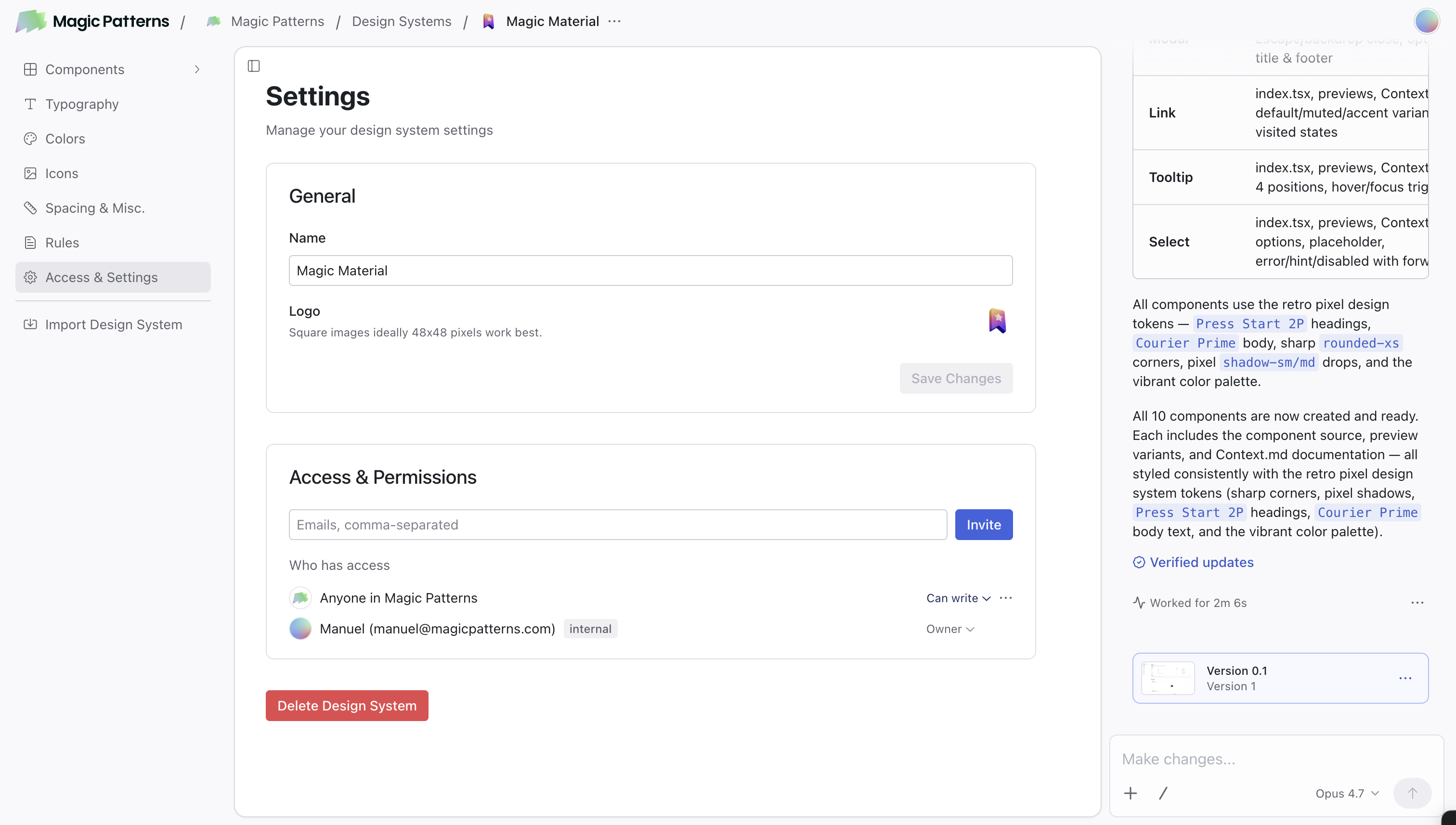
Controlling Access
- Open your Design System
- Click Access & Settings in the left sidebar
- In the Access & Permissions section, enter one or more emails (comma-separated) and click Invite
Learn More
Importing your Design System
Bring an existing design system in from GitHub, NPM, Figma, or your website.
Colors
Visually manage your brand color tokens with dark mode and references.
Rules
Write effective styling rules with examples and naming tips.
Using Components
Create, edit, and manage components in your Design System.
Converting Design Systems
Switch a design from one Design System to another.
Typography and Icons
Manage font groups and icons in your Design System.